Design Brief
Offering Profitable Piece of USA
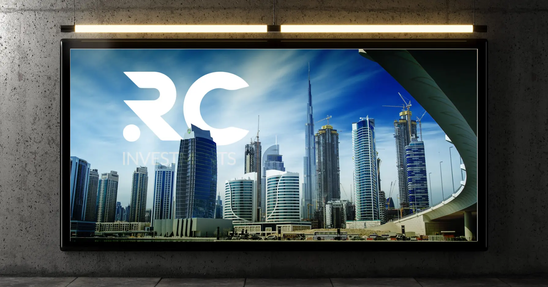
RC investments ask our team of logo designer to design a logo that reflects their expertise in ground positioning and investments. To come up with this, our team created a logo with their brand initials and map in it, ensuring it relates to property investors.

Concept Development
Symbolism and Concept Ideation
At Next Gen Web Builders, we designed the Logo of RC investment to provide strength, and financial growth. With the bold representation of RC typography, we tried to show a strong identity, symbolizing financial progress and successful investment.
Our team utilized multiple colors in bars, aiming to showcase the company's diversity, inclusivity, and global reach. With this blend of elements, we ensured that their logo didn’t lose its essence and remained impactful, professional, and highly recognizable in the real estate sector.
Typography and Colors
Establishing a Consistent Brand Identity
To create a standing brand identity, our team of logo designers utilized a different strategy to meet the aesthetics and boost the credibility. Our team took Lato as primary, and Poppins as secondary font, which were chosen for their clean, modern appeal, ensuring clarity and professionalism across all branding materials.
For the color pallet, we trust the gold (#C0AD82) to represent luxury and success, deep green (#0DA576) symbolizing financial growth and stability, and red (#E15860) for energy and diversity. Complementary shades of dark gray (#464547) and black (#000000) enhance contrast and elegance, reinforcing a timeless and authoritative brand presence.
#C0AD82
#E15860
#0DA576
#464547
#000000
Primary Font
Lato
Aa, Bb, Cc, Dd, Ee, Ff, Gg, Hh, Ii, Jj, Kk, Ll, Mm, Nn, Oo, Pp, Qq, Rr, Ss, Tt, Uu, Vv, Ww, Xx, Yy, Zz


